PROJECT DURATION
THE PROBLEM


PROJECT OVERVIEW
THE PRODUCT
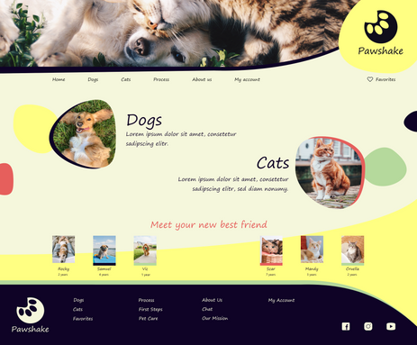
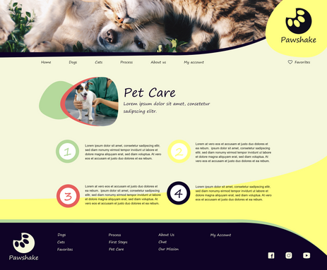
Pawshake is a website for an animal shelter where users can search different pets and apply for adoption.
PROJECT DURATION
From May 2023 to October 2023


THE PROBLEM
Busy workers don't have the time to go on working hours to animal shelters and find a pet to adopt.
GOAL
We are creating a pet adoption flow where users can see different profiles and know more about the pet before adopting. Users will be able to find a pet and apply for adoption.
MY ROL
UX Designer designing a website for animal shelter where users can find and adopt pets.
RESPONSIBILITIES
Conducting interviews, paper and digital wireframing, low and high-fidelity prototyping, conducting usability study, accounting for accessibility and iterating for designs.
User research
SUMMARY
Multiple Interviews were conducted to built empathy maps to understand the user need. A primary users group identified through research some users are not able to personally go to animal shelters on working time.
Other users problems include lack of information about process and paperwork, they don't feel comfortable going to a shelter and just pick a pet, users wants to have the option to get to know the pet better before the adoption process.
PAIN POINTS
1
SCHEDULE
Users can't go to animal shelters outside of operating hours.
2
PROCESS
Users can only check out pet options in person.
PERSONA: Luis
PROBLEM STATEMENT:
Luis is a cat lover who wants to take care of a pet but does not have the time to go to animal shelters.
![Google UX Design Certificate - Persona [Template].jpg](https://static.wixstatic.com/media/c93852_233b4ca82b1d4e7482320d5aeeb1e019~mv2.jpg/v1/fill/w_545,h_306,al_c,q_80,usm_0.66_1.00_0.01,enc_avif,quality_auto/Google%20UX%20Design%20Certificate%20-%20Persona%20%5BTemplate%5D.jpg)
USER JOURNEY MAP
Luis needs to go to an animal shelter and adopt a pet.
![Google UX Design Certificate - Shane user journey map [example].jpg](https://static.wixstatic.com/media/c93852_86bdd3f7ac2d4a1396853a600e7963b9~mv2.jpg/v1/fill/w_545,h_306,al_c,q_80,usm_0.66_1.00_0.01,enc_avif,quality_auto/Google%20UX%20Design%20Certificate%20-%20Shane%20user%20journey%20map%20%5Bexample%5D.jpg)
Starting the design

SITEMAP
I created a clear organizational path for the website. This sitemap shows how pages are prioritized.
PAPPER WIREFRAMES

Taking the time to draft iterations of each screen of the app on paper ensured that the elements that made it to digital wireframes will be well-suited to address user pain points. For the home screen I prioritized a quick and multiple ways to find an event taking into account filters like location and date. and adopt a pet.
Stars were used to mark the elements of each sketch that would be used in the initial digital wireframe.

DIGITAL WIREFRAMES
Moving from paper to digital wireframes made it easy to understand how the redefine could help address user pain points and improve the user experience.
Homepage is optimized for easy browsing and nav menu options.
Digital wireframe screen size variation.

LOW-FIDELITY PROTOTYPE
To create a low fidelity prototype, I connected all the screens involved in the primary user flow of search for a pet and apply for adoption.

USABILITY STUDY: PARAMETERS
STUDY TYPE
Unmoderated usability study.
PARTICIPANTS
5 participants.
LOCATION
United States, remote.
LENGTH
20-30 minutes
USABILITY STUDY: FINDINGS
These were the main findings uncovered by the usability study:
1
MENU
Pet options (dogs and cats) should be included in the main menu and “about us” screen.
2
PROFILE DETAILS
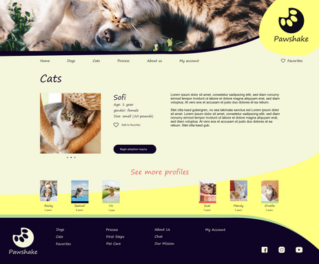
Users weren’t able to find detailed information related to the pet gender or size.
3
ACCOUNT
During the checkout process, there wasn’t a clear way for users to log in to their account.

Before usability Study
Refining the design
MOCKUPS
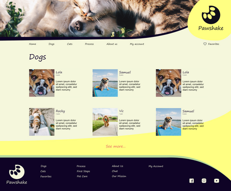
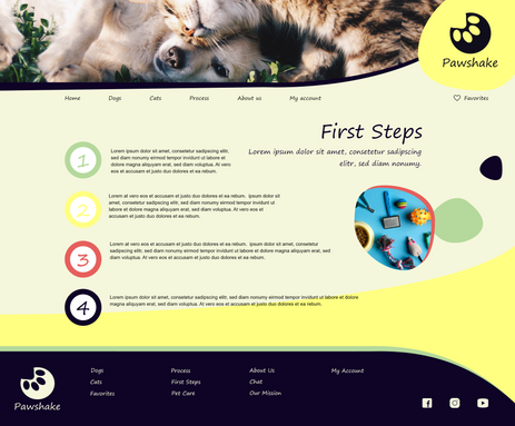
Based on the insights from the usability study, I made changes to improve the site’s menu and process screen. One of the changes I made was adding the dogs and cats option in the menu. This allowed users easily access to pet options. Also, pet options were added to the “about us” screen to show more pets and promote the adoption.

After usability Study
SCREEN SIZE VARIATION
I included considerations for additional screen sizes in my mockups based on my earlier wireframes. I felt it was important to optimize the browsing experience for a range of device sizes, such as mobile and tablet so users have the smoothest experience possible.


Digital wireframe screen size variation.
HIGH-FIDELITY PROTOTYPE
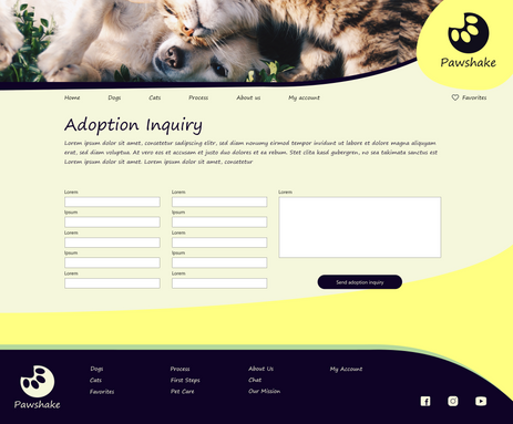
My hi-fi prototype followed the same user flow as the lo-fi prototype, and included the design changes made after the usability study.

ACCESSIBILITY CONSIDARATIONS
1
Provided access to users who are vision impaired through adding alt text to images to screen readers.
2
I used landmarks to help users navigate the site, including users who rely on assistive technologies.
3
Used big and colorful images to help users identify artist and events.
Going forward
TAKEAWAYS
IMPACT
Our target users shared that the design was intuitive to navigate through, more engaging with the images, and demonstrated a clear visual hierarchy.
WHAT I LEARNED
I learned that even a small design change can have a huge impact on the user experience. The most important takeaway for me is to always focus on the real needs of the user when coming up with design ideas and solutions.
NEXT STEPS
1
Conduct follow-up usability testing on the new website.
2
Identify any additional areas of need and ideate on new features.
